A Product Manager’s best friend: Drawing
I’m not great at most things. However, at some, I’m good enough. That’s often what it takes to move a project, product, and team forward. Sketching is one of those things. And surprisingly, it’s a handy tool for a product manager (assuming you work on products with front-end interfaces, and even sometimes when that’s not the case). Drawing is the cheapest, fastest way to get past zero and make some forward progress on a new feature or product. It’s also a significant step before wireframing. Sketching + wireframing is all the “drawing” many product managers will need to be capable of doing. Of course, being able to go beyond that may be required in some environments and is undoubtedly a differentiator and valuable talent. Still, in many, you can get by without it.
Drawing is the cheapest, fastest way to get past zero and make some forward progress
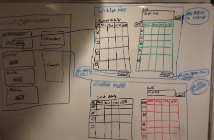
Sketch Samples
Key points:
- These are for you. Nobody is going to see them (unless you decide to include them in a blog post years later). Don’t stress about the details or fidelity. These help you move on from zero and start making progress.
- Whiteboard, pen and paper, colors or black and white… whatever. Whatever is more comfortable for you at that moment for the task at hand.
- It’s nice to look back on these at later stages in the development lifecycle (design, dev, release, in the wild, etc.). Take pics. They’re cringe-worthy but will help with nostalgia later.
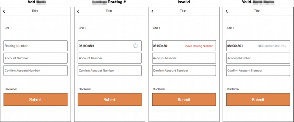
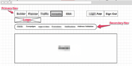
Wireframe Samples
Key points:
- Omnigraffle, Gliffy, Balsamiq, Axure, Keynote… whatever. They all work. I used most of these to create the examples above. Don’t let the tool get in your way. My current go-to is using the Gliffy Diagrams plugin within Confluence. In the past, I’ve had to rely more on Axure to get more complex concepts across in prototype form. The level of fidelity you provide to your team will be dependent on many factors such as your team’s UX process, skill sets, whether it’s an internal tool vs. externally facing experience, etc.
- If you’re fortunate enough to work at a company that prioritizes and invests in user experience, then you probably have a great partner like I’ve had in Alan over the years. In this situation, the hope is that he laughs at a lot of what you did, but thank you for communicating key capabilities and needs. The goal is often not to end up with an experience or set of screens that ‘match’ your wireframes.
- This part is fun. It can feel stressful because you know you need to get over this hump of the project to start to paint the picture to your team of what they’ll be working on potentially, but it should still be fun.
Example Framework
Let’s walk through an example. Here’s a consumer-facing mobile-first site that I had to help design. In this case, there are hundreds of examples out there, and there was no reason to reinvent the wheel completely. That’s true most of the time. But you still need to think outside the box to identify what you should do a little differently than others to accomplish specific goals.
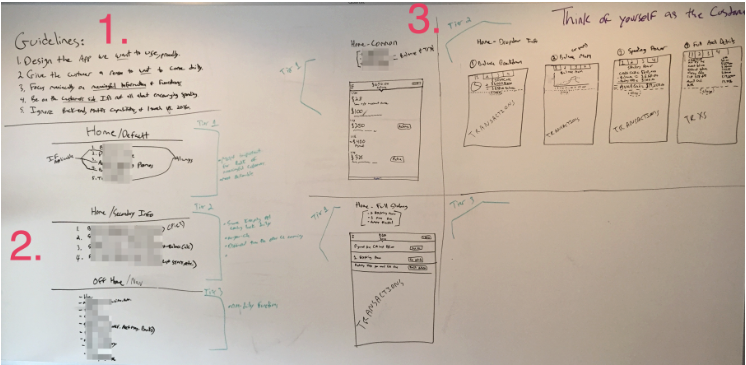
The simple framework I followed to help work through this problem was:
Guidelines > Tiered Hierarchy of Importance > Execution.
Guidelines. I (we) needed guard rails. There were dozens of ways we could have designed a sufficient enough solution but our product had a couple unique constraints and unique value props. Defining guidelines was a way to align everyone on the types of things we will or won’t entertain.
- Design the app we want to use proudly.
- Give the customer a reason to want to come daily.
- Focus maniacally on meaningful information & functions.
- Be on the customer’s side.
- Ignore the backend, Matt‘s capabilities, and what’s possible for launch vs. the future. (Matt is someone I’ve worked with for many years. He’s a great front-end engineer. Love him. But reminders like ‘ignore the backend’ and ‘ignore Matts abilities’ can be vital during the super early design stages, so you don’t box yourself out of potential solutions.)
Hierarchy of Importance. Identifying capabilities and tiering them is necessary for prioritizing what’s most important for a user, needed for a user, and potentially just wanted by some users.
- Tier 1 – Most important for the bulk of meaningful customers. Most actionable.
- Tier 2 – On-your-side rich feature set. Differentiators between us and competing products. Encourage people to come back frequently.
- Tier 3 – Non-daily functions. Potentially required for regulatory reasons or highly desired by select power customers. A place for testing.
Executing on the Design. Defining the hierarchy of importance was key to having a breakthrough in finally ‘designing’ the app (aka identifying new requirements). Well defined tiers made it easy to slot in the capabilities needed.
Combined with the Guidelines, the 3 tiers laid out a framework for what information and features to include as well as a box to operate in when discussing and debating.
‘A Product Manager’s Best Friend‘ is a series aimed at demystifying the role of young product managers. I’m Jared, a PM who has worked in a wide range of environments (fintech & adtech, seed-stage startup to large publicly traded tech & financial services companies, remote and colocated, etc.). I’ve found that there’s a need for practical, straightforward content for PM’s not fortunate enough to find themselves in powerhouses with top-notch product programs like Google & Facebook. Click here for more posts, and please reach out with suggestions or feedback.